ma state senator jason lewis
ma state senator jason lewis
Improving the online self-service experience
Web and Mobile Native App (iOS & Android).
Overview
client
Office of Senator Jason Lewis
My role
Sole UX Designer (end-to-end)
timeline
February-July 2021
client goals
(1) Increase voter base satisfaction to secure Senate re-election
(2) Decrease volume of phone calls and emails for constituent inquiries
constituent goals
(1) Simplify navigation of online services to encourage self-service
(2) Decrease confusion around the role of Senator Lewis and functions of his office
Background
Of the 5th Middlesex District in Massachusetts during the COVID-19 pandemic, over 30% of constituents faced unemployment and house evictions. One of their only options for assistance was Senator Lewis’ office, which serves 60,000+ constituents.
Highlights
(1) Uncovered usability issues real constituents were having with the website
(2) Introduced new UI elements
(3) Explored prototyping
User research and insights
As former Director of Constituent Services to Senator Lewis, I leveraged my experience working with his constituents to deepen my understanding of the problem space.
Still, it was important to gather insights directly from constituents.
To understand the constituents’ mental model and pain points, I facilitated 10 qualitative interviews and card sorting exercises.
I anticipated confusion, but was surprised that constituents remained confused after spending 2-3 minutes on the website.
9 of 10 constituents did not know Senator Lewis’ role or what services his office offers.
INTERVIEWS & CARD SORTING EXERCISES
Opportunity
How might we make getting assistance and information from the senator’s website… faster and simpler than an email or phone call to the office?
problem
At the peak of the COVID pandemic, a new influx of incoming calls and emails to the office overwhelmed Senator Lewis’ team.
Consequently, this led to major delays in assistance.
Key insights
Lack of Awareness
Constituents felt uncertain about who Senator Lewis was and what issues his can office help with.
Use of Jargon
Constituents reported confusion about use of government jargon which led to difficulty navigating the website.
Information Grouping
Constituents felt frustrated with difficulty finding the info they needed on the website.
These key insights added to my initial list of design goals which consisted of the stakeholder’s asks:
Add visual language
Modernize the feel of the website
FRICTION FOR CONSTITUENTS
Lack of Awareness
The average constituent reaching out for help is a resident of the cities of Malden, Stoneham, or Wakefield.
Use of Jargon
Across these 3 cities, nearly 60% are foreign born and speak English as a second language.
Information Grouping
Senator Lewis’ office reports that 80%~ of requests for assistance were related to housing, food, and unemployment.
*According to 2018 Census Reporter
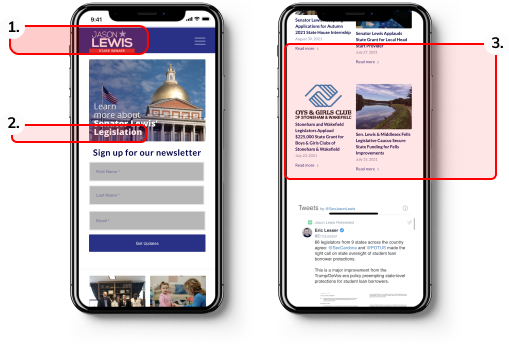
USABILITY TESTING - HOMEPAGE OF ORIGINAL DESIGN
“Who is this guy?”
Constituents didn’t know who Senator Lewis was and what he could for them.
“What do these words mean?
Constituents felt confused about government jargon.
“I’m still confused.”
Constituents still felt unclear about Senator Lewis’ role and services.
I then performed competitive analysis on a variety of government websites to understand the standard industry practice.
I conducted 3 usability tests with more visually modern government websites.
Competitive analysis
These tests yielded a pattern of confusion from constituents despite having more modern UI. This inspired me to challenge the standard government website format which seems to be jarring for the average constituent to use.
Research also revealed that…
constituents’ energy and cognitive loads are low by the time they reach Senator Lewis’ website. This is due to the distress caused by the issue they are seeking assistance for.
So they expect to find information they need quickly on the website.
Ideation
How might we…
(1) Eliminate confusion about who Senator Lewis is and what his services are in the constituent flow?
Solution: Clearly define the role and functions of Senator Lewis and his office on the homepage.
(2) Create an intuitive and efficient online assistance experience for the average constituent?
Solution: Simplify the information architecture and language to encourage self-service.
Wire-framing
Considering these pain points, my low-fi sketches reorganized the information architecture and broke up the information flow to help reduce cognitive workload.
Aligning with the stakeholder
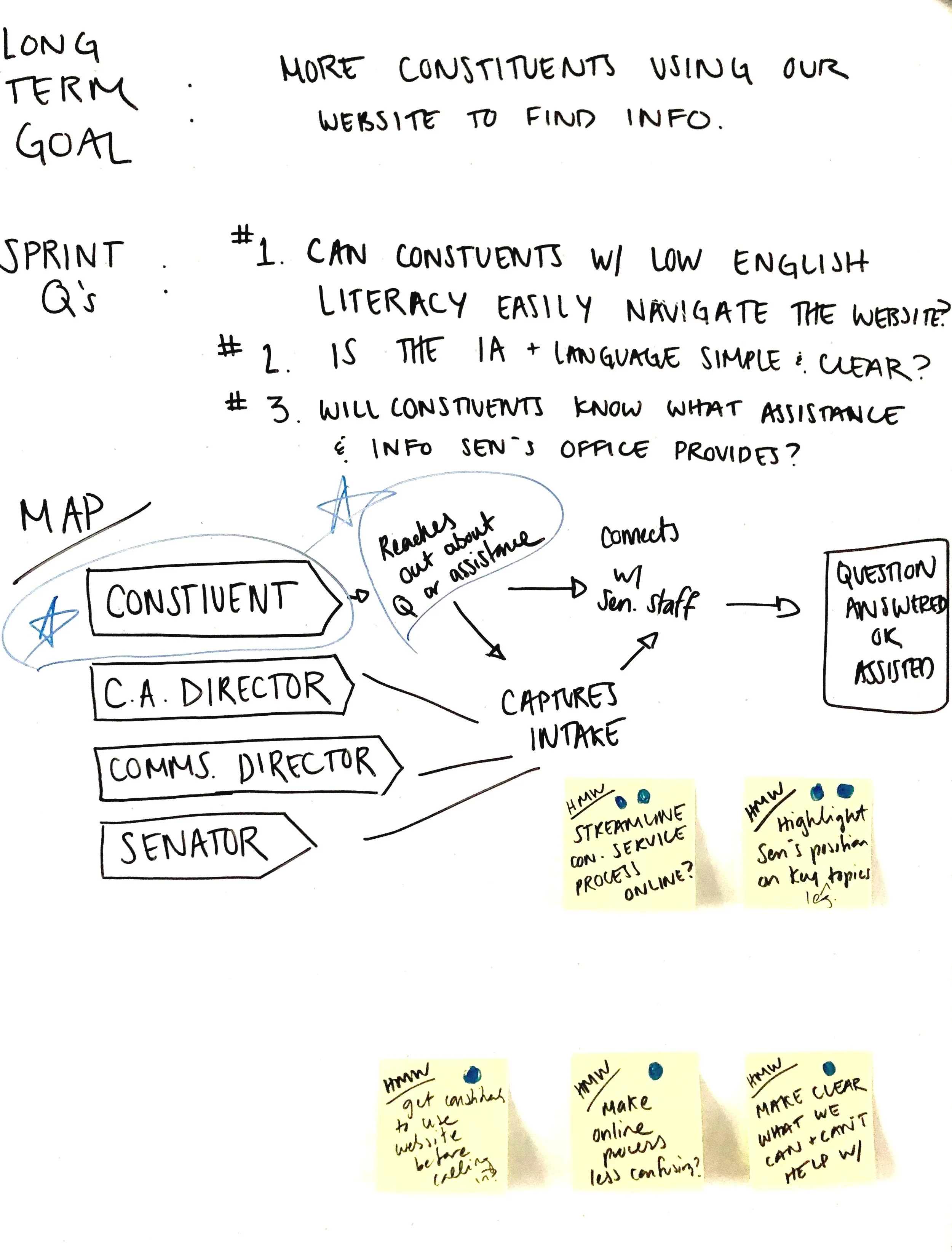
I facilitated a Google Sprint workshop with Senator Lewis’ team to determine the decisions moving forward and align on business goals and budget constraints.
Design goals
1) 1. Senator Lewis' Role & Services
Clarify who Senator Jason Lewis is and what issues his office can help with.
4. Visual Language
Add use of visual language throughout website to help assist constituents navigate the website.
2. Natural Language
Change use of government jargon to simplified, layman’s terms throughout website to eliminate confusion.
5. Revamp UI
Modernize the feel of the website yet not make the experience too jarring for audiences in the public sector.
3. Information Architecture
Reorganize information on the website into intuitive groupings that make most sense to constituents.
Solution
*The design solutions are implemented throughout the website. Only the homepage is shown for the portfolio.
I explored a few iterations of a hi-fi prototype and tested with 5 constituents.
1ST ITERATION - PROTOTYPE TESTING FEEDBACK
1.Senator Lewis’ role & services still unclear
Despite providing Senator Lewis’ role in the hero page, constituents were uncertain about what a State Senator does and whether he represents them.
2. Natural language but not descriptive
Testing invalidated my assumption that large CTA buttons with more intuitive terms would be effective. They were still too vague for constituents.
3. Visual language with photos too vague
Constituents reported that these photos don’t help clarify confusion about who the Senator is and what he does for them.
4. Modern UI but not good design
This template models a lead modern competitor from my research. Constituents reported similar patterns of confusion as original design, proving not to be most intuitive or efficient template.
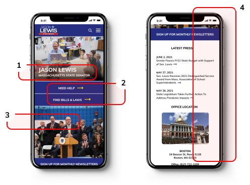
FINAL ITERATION - DESIGN CHANGES INFORMED BY PROTOTYPE TESTING FEEDBACK
1.Senator Lewis’ role specified
Constituents reported identifying info on homepage helps clarify some confusion about the Senator.
2.Modern and effective design
By using elements such as cards, the feel is fresh yet information flow is more digestible. This is different from anything present in the government space.
3.Senator Lewis’ services specified
Specifying the services in simple language helps clarify confusion off the bat.
4.Iconography effective visual language
Pairing specific iconography instead of photos of the Senator provides easier navigation.
5.Clear & natural language
Constituents found use of layman’s terms & first-person voice easy & inviting to navigate the website.
next steps
I presented the final deliverables to Senator Lewis and successfully gained his approval for the redesign. Due to a last minute increased compensation ask from the engineer team, this project is placed on hold.
Getting Stakeholder Buy-in
DEFINING METRICS OF SUCCESS FOR STAKEHOLDER
(1) Decrease constituent service inquiries by phone and email
(2) Increase constituent satisfaction of Senator Lewis’ services
(3) Increase voter base and secure re-election for Senator Lewis
What I learned
GOOD DESIGN IS IMPORTANT IN ALL SECTORS
My biggest challenge was to modernize the UI and copy without making it too jarring for the public sector.
HOW TO OPTIMIZE BUDGET CONSTRAINTS
I learned to work closely with the stakeholder’s team and engineer to create the best possible experience within budget constraints.
WORKING EFFICIENTLY WITH STAKEHOLDERS
I practiced facilitating efficient meetings with consideration of stakeholders’ busy schedules.


